

BioFlex
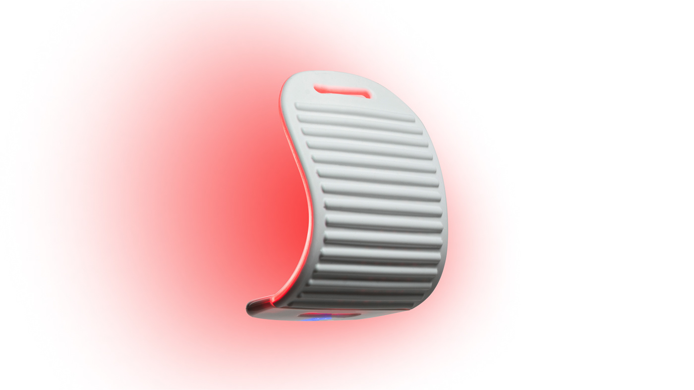
BIOFLEX® specializes in Low Intensity Laser Therapy (LILT) Designed and Manufactured in Canada, providing a non-invasive solution for chronic and acute pain. Adopted globally by healthcare professionals, BIOFLEX is dedicated to leveraging light's healing power as a safe and effective alternative for pain relief.
THE GOAL
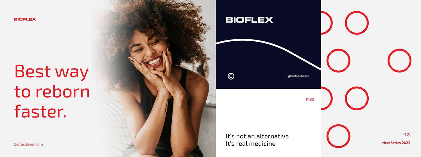
The goal of this creative endeavor is to elevate BIOFLEX's brand identity by seamlessly blending innovation, adaptability, and visual sophistication. Through strategic design choices, the aim is to position BIOFLEX as a modern, dynamic, and recognizable player in the health technology market. The redesigned elements, from packaging to the logo, seek to communicate the brand's positive impact, versatility, and technological edge. Ultimately, the goal is to create a cohesive and iconic brand image that resonates with the target audience, fosters brand recognition, and sets BIOFLEX apart in the competitive landscape.
THE APPROACH
Working closely with Drake's team, we navigated the current brand identity landscape, focusing on visually representing the positive impact of BIOFLEX's innovative products. Despite the unexpected challenge of competing with an ongoing product photoshoot, we swiftly delved into the essence of BIOFLEX's versatile and innovative products, transforming their qualities into visually striking images. Our dynamic and refined design lines, inspired by the adaptability of BIOFLEX products, create an iconic aesthetic that connects with the brand's essence.
To enhance brand recognition, we reimagined BIOFLEX's iconic symbol for a digital era. The original complex symbol limited its versatility in modern, digital mediums. Our solution involved creating brand variations tailored for specific uses, adjusting weights and spaces within the logo's elements. The result is a synthesized symbol that maintains its essence while offering adaptability for reduced sizes. Exo 2, a contemporary and iconic typeface, was chosen to complement the redesigned logo.
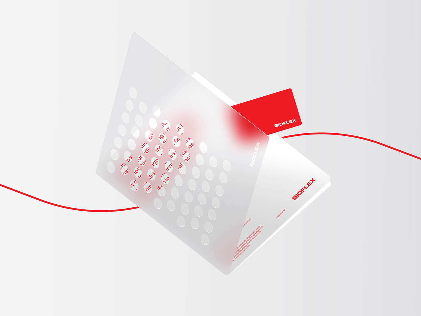
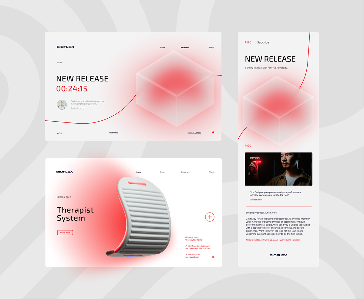
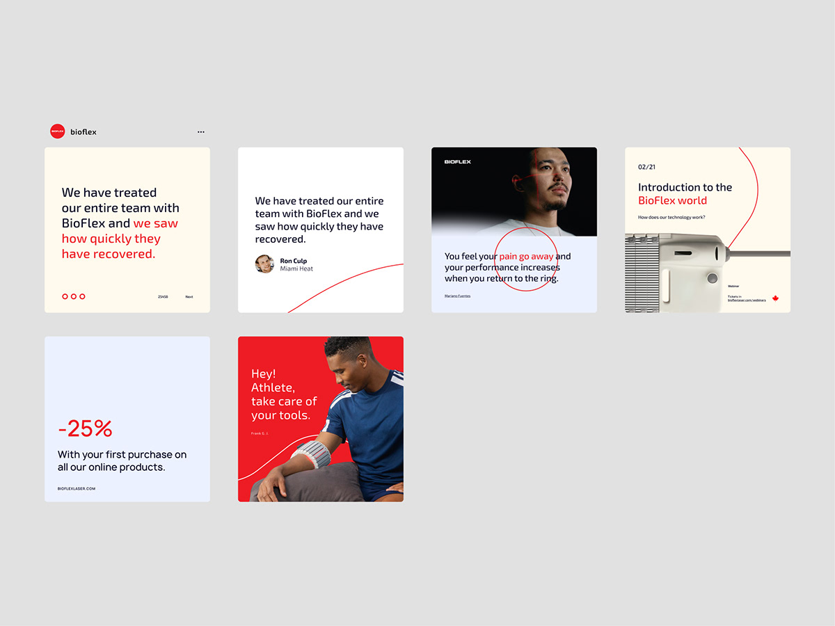
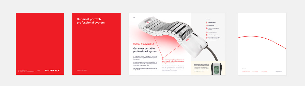
For iconography, we embraced simplicity with bold, consistent linework, rounded corners, and circular solid shapes. The redesigned international sales documents for Canada and the United States showcase the comprehensive development of BIOFLEX's visual identity. The clear, concise, and identifiable design, coupled with quality content, transformed these documents into easily adoptable sales materials replicated across various channels.


BIOFLEX Web
Hired Services:
Brand Re-Design
Stationery Design
Brochure & Triptych Design
Custom Mockups
Social Media Assets
Visual Identity
Photography Editing
Iconography Design
Creative Advisory
Marketing Strategy & Creative Advisor: Drake Global Strategy
Creative Direction, Logo & Rebranding: Facundo Kostelak
Creative Advisor: Catalina Mendivil Castellote
Find out more at zendastudio.com


